Dark Patterns
Dark Patterns is something that I have increasingly started seeing while using apps and went into a rabbit hole reading about them leading to this deep dive
Dark Patterns being used by apps is something that I started observing a year back and over the past year, I have seen more and more apps using dark patterns to exploit the customers.
This has been something that has led to me to switch apps to apps with a cleaner and user-friendly UI given my bad customer experience with apps using dark patterns.
Thus, I thought I would try to dig deeper to understand more about dark patterns, how consumer apps use them, government action on the same and finally, how can we switch to bright patterns (opposite of dark patterns) more consciously as both users and creators of these apps.
How do Dark Patterns Work?
Dark patterns exploit basic human psychology—our tendency to avoid friction, our fear of missing out, and our trust in digital interfaces. Some are overt, like countdown timers that reset when a page reloads, creating false urgency. Others are sneakier: a food delivery app auto-filling your cart with a “usual” order you haven’t placed in months, or forcing you to opt into marketing emails during sign-up by default.
Why is it important to understand dark patterns ?
India’s digital economy is exploding. With over 750 million internet users as of early 2024, everything from groceries to investment plans is just a tap away.
This has led to increased focus on convenience to make it easier for users to book cabs, tickets, order groceries etc. but this convenience can also lead to manipulative design tactics that trick users into making choices they didn’t intend—like buying add-ons, sharing personal data, or unknowingly subscribing to paid services.
Why do Companies do This?
The answer lies in incentives. Product managers and growth teams face enormous pressure to improve conversion rates, retention, and average order values. In this high-stakes environment, dark patterns often outperform transparent designs in A/B tests. When one competitor uses them, others feel forced to follow or risk being left behind. Add to that the reality that most users don’t notice—or don’t push back—and the calculus seems simple: dark patterns deliver results.
But this short-term thinking comes with a long-term cost. When users feel tricked, they lose trust. They complain on social media. They stop recommending the brand. What’s worse, vulnerable users—such as seniors or those with limited digital literacy—are disproportionately affected, making this not just a design issue, but a moral one.
Do all apps do this ?
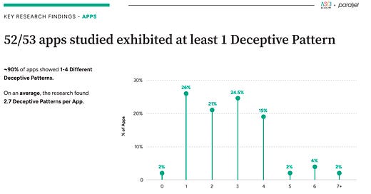
In August 2024, a collaborative study (Link) was conducted by Advertising Standard Council of India Academy and Parallel, to study dark patterns across 53 top consumer apps in India
According to the study 90% of the apps showed 1-4 different deceptive patterns, with on average 2.7 deceptive patterns being used per app
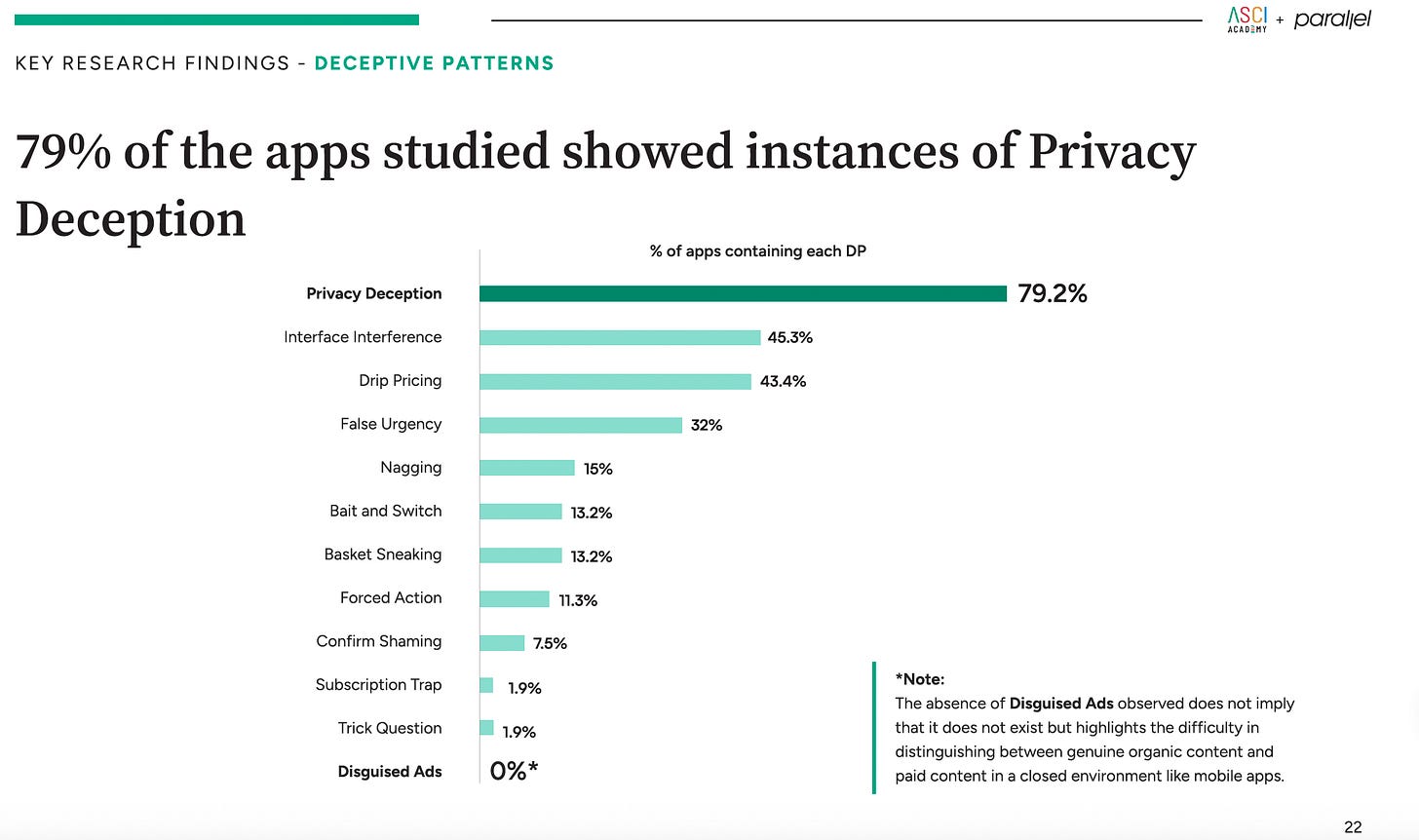
Out of the common dark patterns being used Privacy Deception (79%) was the most common dark pattern being observed
What do dark patterns look like ?
Conscious Patterns (Link) is one great website to understand about dark patterns and for product managers to study about ethical design patterns.
For example, basket sneaking (Shown below) is something that is common across both food delivery and quick commerce apps to get consumers to purchase their passes. This is one of the main reasons why I do not like Zepto’s UI as it constantly adds Zepto Pass on every order.
Drip Pricing is another common feature being used where the final cart value is much higher than the original price as platforms sneak in additional costs such as handling charges, packaging charges, platform fees, convenience fees. This is something that has been used by OTAs for long periods of time during flight booking but has slowly been used by consumer apps as well.
What does the other side look like ?
But it is not all gloomy, there are companies that are also using bright patterns or ethical patterns to provide better customer experience to customers
What can you do about it ?
Our actions should be driven by what we want in the long term for the apps to look like as most of our time is now being spent on the screen using these apps and some like ride hailing apps, food deliver, quick com etc. have become essential for the services they provide.
Users - Users can look at dark pattern apps, if they feel that the app is not essential to them , they can switch to apps that use bright patterns instead of sticking with the dark pattern apps. They can also raise the same concern on social media, help make more people aware about it.
Product Manager/Designers - Can use websites like Conscious Patterns to judge whether design is ethical and not. There are a lot of websites that explain what dark patterns are. These can be studied to understand when you are going the wrong way. Business objectives can be achieved without using dark patterns as shown by the large number of apps that use them as show and that would be helpful in the long run because as more consumer realise that they have been overcharged or have an item extra in their basket than they required they would start switching apps. Thus, the dark patterns hamper the consumer experience in itself.
Government - Government has already started taking action against these dark patterns through various regulations over the last few years and also banned apps to use some of these patterns. The data privacy bill that the government has passed also has laws to protect the users privacy.
This article was an effort to make consumers more aware about these dark patterns, so that they can start their journey of observation just like I did a year back. The point is to create awareness and talk about it more on platforms like these to reduce the usage in favour of the customer and their experience with the app.
If there are any PMs or users that have encountered similar issues or ethical dilemmas would love to hear out your experiences


Very Insightful!